
This was a different kind of paint scheme. It’s kind of a green/blue grey, with black accents. I call this my mint chocolate chip army.
For those of you not familiar with the war game, this faction is basically AI robot people. And the soldiers are AI recreations of the cast of the Illiad.

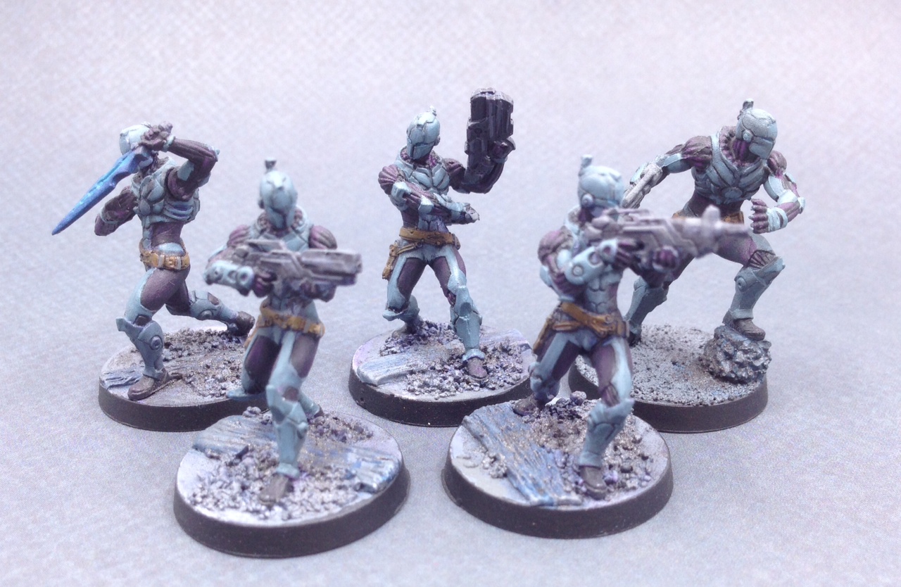
The doctor and the sniper.

The one on the right was the test mini for this scheme. Originally she was more grey, but it was just too bland. Switched to the greenish color, and some blue inks, but still wasn’t there. Then the middle one, with more purples, getting there, and for the infantry test I used the hacker on the right.

By these, I’ve got the paint scheme worked out. I love the red head. 🙂

Myrmidons.
The robots probably could have used some more contrasting colors. But I had to rush them.


I kind of slopped the free hand on these guys, but they were a rush job to have some sentry robots done in time for a game night.

Now Mr. Hammer Time here, (Ajax) I think this mini came out fantastic.


OT: Sorry to start it off OT but I am about a quarter or a third of the way through Son of the Black Sword. It is great. I never doubted you had the chops for fantasy but this exceeded all my expectation. It’s like Raymond Chandler writing SciFi.
I am at the prison scene where Ashok is teaching the warden. I hope many more are in the future. I like the sly reference to the horns. Not many would get that unless they knew your background. I had a friend in the church that actually happened to when he was a kid. All the details of the world and the society are extremely cool.
When I am done I will give it to my son unless it gets too risque. He’s only twelve but loves S&S. You’ve written so many good characters in this story that even if Ashok does go to his reward at some point I would hate to see you leave this universe you’ve created.
Good work, more please!
BTW … the old wordpress link no longer redirects here. My bookmark was a bit old, and I suddenly fell into a time warp ….
Also, now it’s showing an error overlay: “Oh no! This blog’s address monsterhunternatino.com expired N days ago!” (Currently N = 2). Clearly incorrect, since I’m able to type this here with no problems… but WordPress’s information is apparently out-of-date.
Whenever one is having issues with color schemes, it’s helpful to remember painters first make their paintings in black and white; the color (hue) then follows value. When value is ignored in favor of color, something like the lettering of a book cover can fade into the background, even if it’s the opposite (complimentary) colors. It is very difficult to construct a color scheme by using only hues rather than values. But Marvel Comics covers in the ’60s usually went against that in order to give their covers a flat look with bold vibrating covers which stood out, rather than a black and white effect by, for example, someone like Will Eisner, the guy who drew The Spirit. That Marvel scheme of building by hues doesn’t really work for figures.
It’s helpful to occasionally look at a book design in black and white while working on it. If you look at those old Marvel covers in black and white, they are mostly the same value, the same shade of gray. It’s a cool “op-art” effect. But the most successful schemes for figures are high contrast, also keeping in mind cool colors recede and warm come forward. I’ve sometimes seen painters use color as well as shading to emphasize the edge of an arm, for example. Contrasting values are more important than contrasting opposite colors.
The terminology is more complex than that, with people using terms (sometimes interchangeably) like tone, tint, shading, etc, but the fundamental concept is looking at your colors in shades of grey first and color second. Try looking at some of the photos above in black and white.
You’ve got the AIs, trans-humans, and other high-tech stuff.
And then you’ve got Ajax with a leather satchel.
😛
Are you planning on doing Achilles 2.0 with the morat head?
Probably just the regular one with the sword, because if he’s not fighting Morats at the time, I’d be curious why he was carrying around a Morat head. 🙂
Doesn’t *everyone* have a spare Morat head that they carry around with them?
[eyes hammer dude]
Someone shrank the International Lord of Hate!
What did you do for the red hair? I just did a miniature Kerkonen (werewolf) but she turned kinda orange. At least the photo looks that way. The sniper dude is my favorite, he just looks bad ass. Ajax also looks the business!
Just some different reds. I can’t recall what colors now. I’ve done orange, yellow, and reddish red heads just to mix it up.
I’m not sure what paints you guys tend to use or whether you use brush or air brush. I guess LC uses air brush. People tend to dilute air brush paint so it doesn’t clog the brush. I never painted miniatures but did a lot of model airplanes. Enamel paints are very opaque and so the color you see is what you get. Thinner paints might be affected by the underlying color and make for problems. The solution is to apply a white base coat so you can consistently see what is leaking through and how well the paint is covering. It may also make your colors brighter. Unless your paint is very thick, painting a figure over its original color would be a problem and give drab results affected by whatever color the figure is molded from. If these molds come in different colors then the same color paint may give off different colors. An undercoat also gives a better surface for paint to stick to.
I use both brush and air brush.
You always prime. That’s pretty much mandatory. There are pros and cons to both white and black, depending on what you are doing. I also do a lot of zenithal, so black prime coat, dusting of white from directly above.
Mini painting you are usually using thin paints and multiple layers so you can get depth and variation to your shading.